Vita Sanus
Designed a responsive health and wellness portal for health-conscious individuals. It allows users to record and manage their health and medical information while providing a variety of features to promote physical and mental well-being
My role: UX/UI Designer
HCD Methods: Competitive analysis, user research, user personas, card sorting, affinity mapping, user flow analysis, low to high-fidelity wireframes, prototypes, usability testing.
Features: Recipe discovery, article favorites, and personalized reminders.
Tools: Figma, Canva, Usability Hub, Lucidchart, Unsplash

Project Overview
Issue: Health-conscious people need a trusted place where they can access and manage their health and medical information because juggling between multiple apps leads to difficulty in sustaining a consistent routine and achieving wellness objectives.
Goal: to create a friendly health and wellness app with easy to follow fitness routines, nutritious recipes, mindful meditation sessions and easy to store medical records, in order to offer people a holistic approach for their well-being and help them achieve a balanced lifestyle.
Executive Summary
Streamlined health management by designing an all-in-one health and wellness app to centralize personal wellness, health and medical data.
Project Highlights:
Developed competitive analysis, a survey with 17 participants and 3 user interviews to inform design decisions using user personas.
Enhanced user experience through card sorting with 5 participants, affinity mapping and user flow analysis.
Designed low to high-fidelity wireframes and prototypes, featuring recipe discovery, article favorites, and personalized reminders.
Conducted usability tests with 6 participants, iterated based on feedback and collaborated in feedback rounds with colleagues.
Watch Prototype Demo
Research
Competitor analysis
I chose OneRecord and FollowMyHealth
because these popular apps help manage, store personal health records and communicate with healthcare providers in one place.
Analyzed each app based on:
key objectives
overall strategy
marketing advantages
SWOT analysis
UX competitive analysis
Conducted a competitor analysis in order to gain more insights into the current market and user expectations, helping me spot opportunities for my app.
Conclusion
Although OneRecord and FollowMyHealth offer robust platforms for storing medical information, they fall short in providing comprehensive wellness resources, giving the opportunity for others to offer a more holistic health management experience.


Research goals
To better understand the characteristics, behaviors and motivations of potential users.
To identify and document user needs, pain points and challenges with the help of similar apps on the market.
To identify what kind of support do users seek in their daily lives in order to achieve their goals.
To find out what users hope to achieve in a health and wellness app.
To determine what kind of desired features are our potential users looking for in a health and wellbeing app.
Survey
Created a user survey because I wanted a way to reach a broad audience. I used Google forms and shared on my social media and via email.
17 people participated
Target audience: health conscious individuals, 18+
Combination of multiple-choice questions and open-ended responses (see example below)


Survey Insights:
Major challenges: balancing work and personal life.
Helpful techniques to manage health: regular physical activities & healthy eating.
Goals: Form habits, improve fitness and mental health, reduce irritability, tips/tricks for time management and achieve goals, better organization, better quality of life, focus on the moment, weight management, tools for better mental health such as stress and anxiety, goals tracking, consistency and happiness.
Desired features: Personalized goal-setting and goal tracking, workout routines, recipes, stress management techniques, games, reminders, mood tracking, health and wellness articles, integration with wearables devices, sleep tracking and recommendations.
Interview
Conducted 3 user interviews in order to observe behaviors and facial expressions, gaining deeper insight into the emotions and experiences of people.
Interview script in order to give people a quick overview of the purpose of the interview.
11 open-ended questions focused mainly to better understand characteristics, behaviors and motivations of potential users. Identify needs, pain points and challenges, what kind of support do users seek, and what they hope to achieve in a health and wellness app.


Research Analysis
By asking WHAT? HOW? & WHY?
I gained access to insights into users’ needs, motivations and challenges.
Affinity Mapping
Created an affinity map in order to synthesize my research data, categorize user feedback, identify patterns and highlight key insights.

Key Insights
Users have a deep concern for their physical and mental health.
They seek to take control and be proactive in managing their overall wellness.
They desire assistance with organization, categorization, reminders and progress tracking.
Their goal is to achieve a balanced life and become their best selves through improved eating habits, health education, stress management, meditation and continuous self-improvement.
Define
User Personas
Created 3 user personas to better understand and address the diverse needs and behaviors of Vita Sanus' potential users in order to ensure it meets their health and wellness goals.
These personas helped me to understand the target audience in a better way and make sure I could design with a user-centric approach.

These 3 personas reflect some of the main target users and their expectations. This allowed me to effectively design towards meeting their needs, and providing a user experience that meets their expectations.
Journey Mapping
Based on my research I created journey maps for 2 of my personas to illustrate different user interactions.
I created a scenario for Manuel and Mia in order to set a goal and identify steps to achieve it. Based on my personas' challenges, motivations and needs, I was able to identify the steps that users must take in order to achieve specific objectives and how they would react in each phase. All with the goal of optimizing user flow and ensuring a seamless and enjoyable experience for Vita Sanus.
Manuel's goal is to use Vita Sanus app to store medical information that he can forward or bring along when he sees different doctors.
Mia's goal is to use our health and wellness app, where she can select her health journey, set her goals and receive reminders.


Ideate
Card Sorting
Conducted card sorting in order to organize content intuitively and enhance navigability for a better user experience.
Hybrid card sort
5 participants
Random order
7 categories
20 cards
Similarity matrix & Standardization grid


Conclusion
Participants agreed on categorizing exercise and fitness under body health.
Weak consensus on resources as a standalone category; dispersed across mental, body, and medical health.
Difficulty in classifying tools, wellness trackers, sharing options and appointment settings, suggesting a need for clearer guidance in Vita Sanus.
Site Map
Based on card sorting results, an improved site map was refined to help users find what they need quickly and easily.

User Flow
After creating user personas and journey maps, I developed user flows to guide users to their desired outcomes.
Below you can find:
Manuel's user flow: Set a medication reminder
Annie's user flow: Find and save an article about stress
Mia's user flow: Find and save a recipe
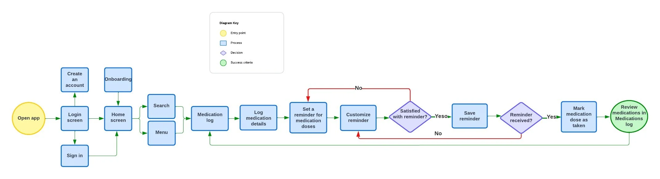
Task Flow: Manage and track medications by setting reminders
Creating user flows helped me pinpoint and organize the steps users will need to take in order to accomplish a goal. It helped me understand how the users will interact with Vita Sanus and how to prepare strategies for when they deviate from the intended navigation path.
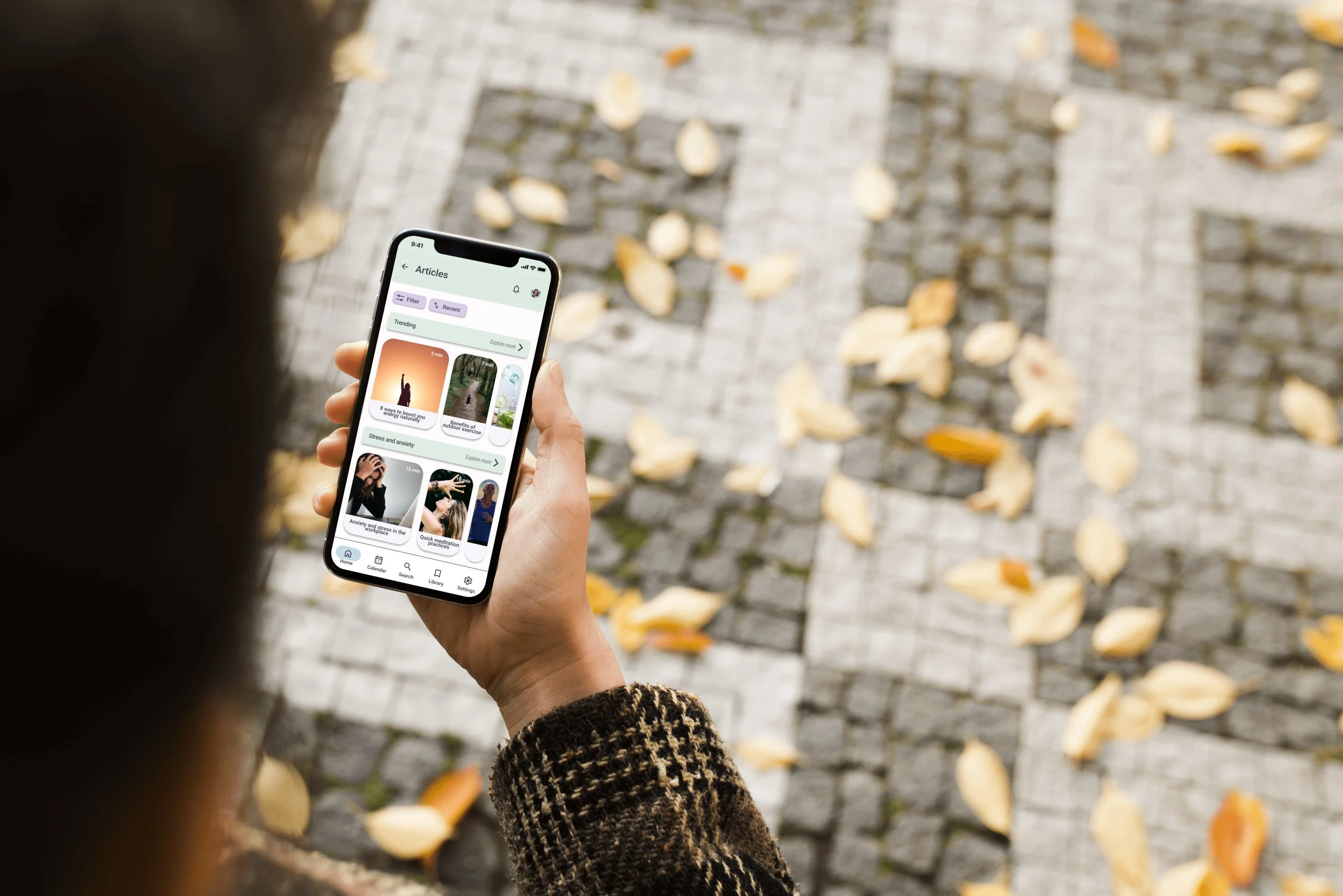
Wireframes & Prototypes
Low-Fidelity Wireframes
Designed low-fidelity wireframes followed by mid-fidelity wireframes to progressively refine Vita Sanus design from basic paper and pencil layouts to more detailed interfaces, with the goal of facilitating iterative testing and obtain useful feedback from potential users.
Find and save a recipe
Home Page: select body section
Body page: select recipes
Recipes page: select a category. Ex: Breakfast
Categories: select a recipe
View recipe and save

Set a medication reminder
Home page: select medical section
Medical page: select medications
Select medication to set a reminder
Set a reminder and save


Find and save an article
Home page: select mental section
Mental page: select articles
Select article. Ex: in stress & anxiety section
View article & save
Mid-Fidelity Wireframes
Find and save a recipe
Home page: select mind section
Mind page: select articles
Select article. Ex: in stress & anxiety section
View article & save

Set a medication reminder
Home page: select medical section
Medical page: select medications
Select medication to set a reminder
Set a reminder and save

Find and save an article
Home page: select body section
Body page: select recipes
Recipes page: select a category. Ex: Breakfast
Categories: select a recipe
View recipe and save

Test
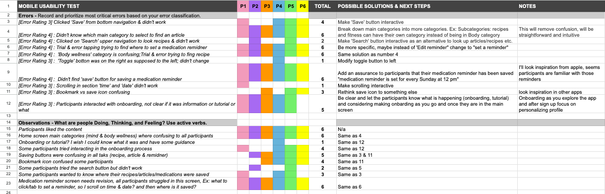
Usability test
Conducted a usability test for Vita Sanus to evaluate its user-friendliness, identify any pain points and enhance the overall user experience based on real feedback.
Test
6 participants
Methods used: moderated in-person and moderated remote.
All participants received consent and recording forms before the tests.
Usability Test Report
Valuable feedback gathered from usability tests with similar points across participants.
Initial difficulty in navigation due to unclear category names on the Home Screen.
Post-acclimatization, participants found the app easy to explore.
Positive feedback on app interaction and content coverage.
Test objectives
To ensure the app’s usability and utility across different devices
To evaluate users’ ability to access the app’s resources such as articles, recipes, medications and calendar.
To evaluate users’ ability to navigate seemingly through the app while performing a task such as saving a recipe/article or setting a medication reminder without getting constantly stuck or being able to recover from an error.
To have a user-friendly experience and high user satisfaction

Affinity Map
Created an affinity map based on the usability test results to categorize and analyze user feedback based on observation, positive quotes, negative quotes and errors in order to improve the app's functionality.

Iterations
Usability testing brought me good insights, one of them being a constant confusion on the home page due to the categories and another main one was having a save button for a medication reminder.
Re-designed the site map based on user feedback received from the usability testing. Having 3 main categories (body, health and mind) was confusing for many of the users, therefore decided to have 2 main categories called Healthy living and Medical records which you are able to access directly from the home page without needing to navigate further. In healthy living you are able to find everything that was meant to be under body and mind health in order to reduce ambiguity.

Home Page
"Body wellness is not clear"
"I don't immediately associate body wellness with recipes"
"I don't know if to tap body or mind to find a wellness article"
Issue 1: The categorization under “body wellness” from the home screen appears confusing and non-intuitive for participants during recipe search. (high severity)
Suggested change: Extract “recipes” and “fitness” form under the “body wellness” category and establish them as main categories on the home screen. Clear, well-defined categories would provide a more direct and user-friendly pathway.
Evidence: Participants struggled to find a recipe because the category name “body wellness” wasn’t intuitive for them. As a result, participants were observed clicking on other categories in search or recipe options, which led to frustration and wasted time. This behavior was recorded multiple times to access different test sessions and with different participants.


My goals, wellness tracker & upcoming appointments used to be in home screen and were moved to “my profile”
Straightforward categories in home screen

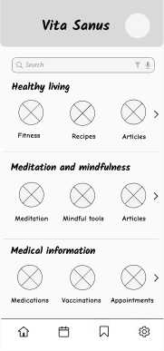
Modifications made:
My goals, wellness tracker & upcoming appointments went from the home page to the profile section.
The 3 main categories: Body, mind and medical health became 2, which are now are "Healthy living" and "Medical records", with the goal of creating simplicity and a more intuitive design.

Medication Reminder Page
"Saving a medical reminder seems tricky"
"I don't find where to tap or set my reminder"
"I don't know if I saved my medical reminder"
Issue 4: Participants faced difficulty in finding a save button while attempting to save a medication reminder, which resulted in uncertainty about whether the reminder was successfully saved. (high severity)
Suggested change: implement a clearly labeled “save” button within the medication reminder feature to provide users with assurance that their reminders are being saved.
Evidence: Participants expressed confusion and uncertainty when attempting to save a medication reminder. They were unable to find a save button and led participants to feel frustrated and with doubts whether their medication reminders were being recorded.

Modifications made:
Added a save button for assurance
Made sure they can see the toggle button "ON" mode.
Implement
Established a design system for my Vita Sanus app to provide a structured visual language, promote consistency across the app and to provide standardized guidelines for other designers to understand and utilize the design elements and principles.
Logo


Color Palette
Icons

Illustrations

Imagery

Typography

Design System


Layout grid

Iphone
Layout grid columns
Count 5
Gutter 20
Margin 16

Desktop
Layout grid columns
Count 12
Gutter 20
Margin 70
I followed the Web Content Accessibility Guidelines (WCAG) 2.2, to ensure the Vita Sanus app is accessible to a wide range of users. I improved contrast between background and text and between buttons and text. In addition, I made sure the font size isn't smaller than 12.
Accessibility
Design Collaboration
Although I was the sole designer on the Vita Sanus project, participating in a round of feedback with my peers proved to be essential; their objective viewpoints helped me identify crucial details I had missed, broad-opened my perspective and played a significant role in my development as a more effective and insightful designer.


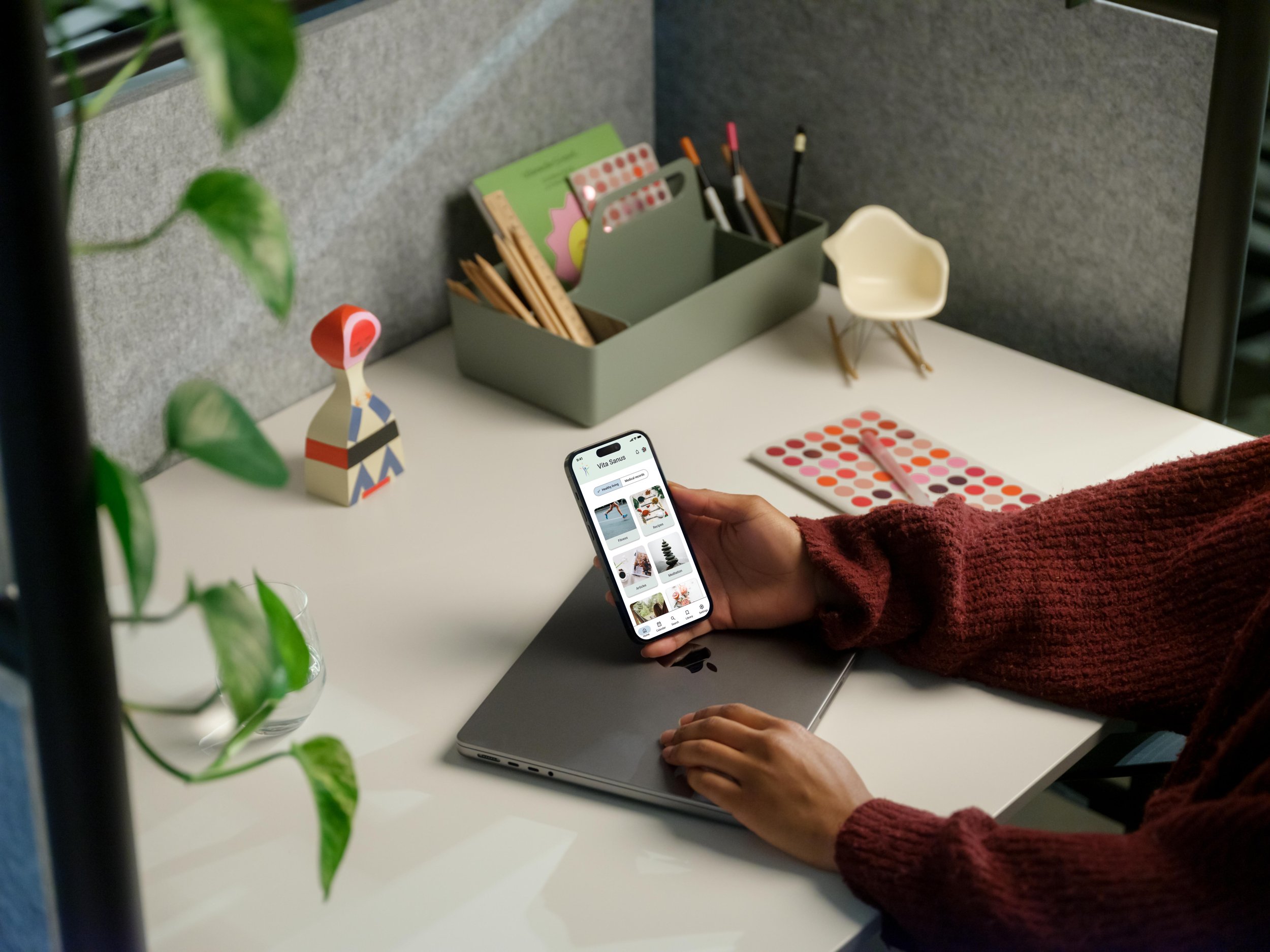
Mockups
Created high-fidelity wireframes to facilitate clear communication of design intent, user experience and functionality.


Reflection
Discovered the importance of building prototypes, from sketches to interactive models, to test features and identify issues early, saving time and effort.
Gained insights through user testing, observing how people interact with prototypes to identify usability challenges, preferences, and confusion points.
Valued user feedback highly, using it to iterate on designs, refine features, and enhance the overall user experience.
Embraced the need for flexibility in the design process, willing to revisit decisions, create new iterations, site maps, user flows, and sketches to better meet user goals and improve usability.