Terra Vista Estates
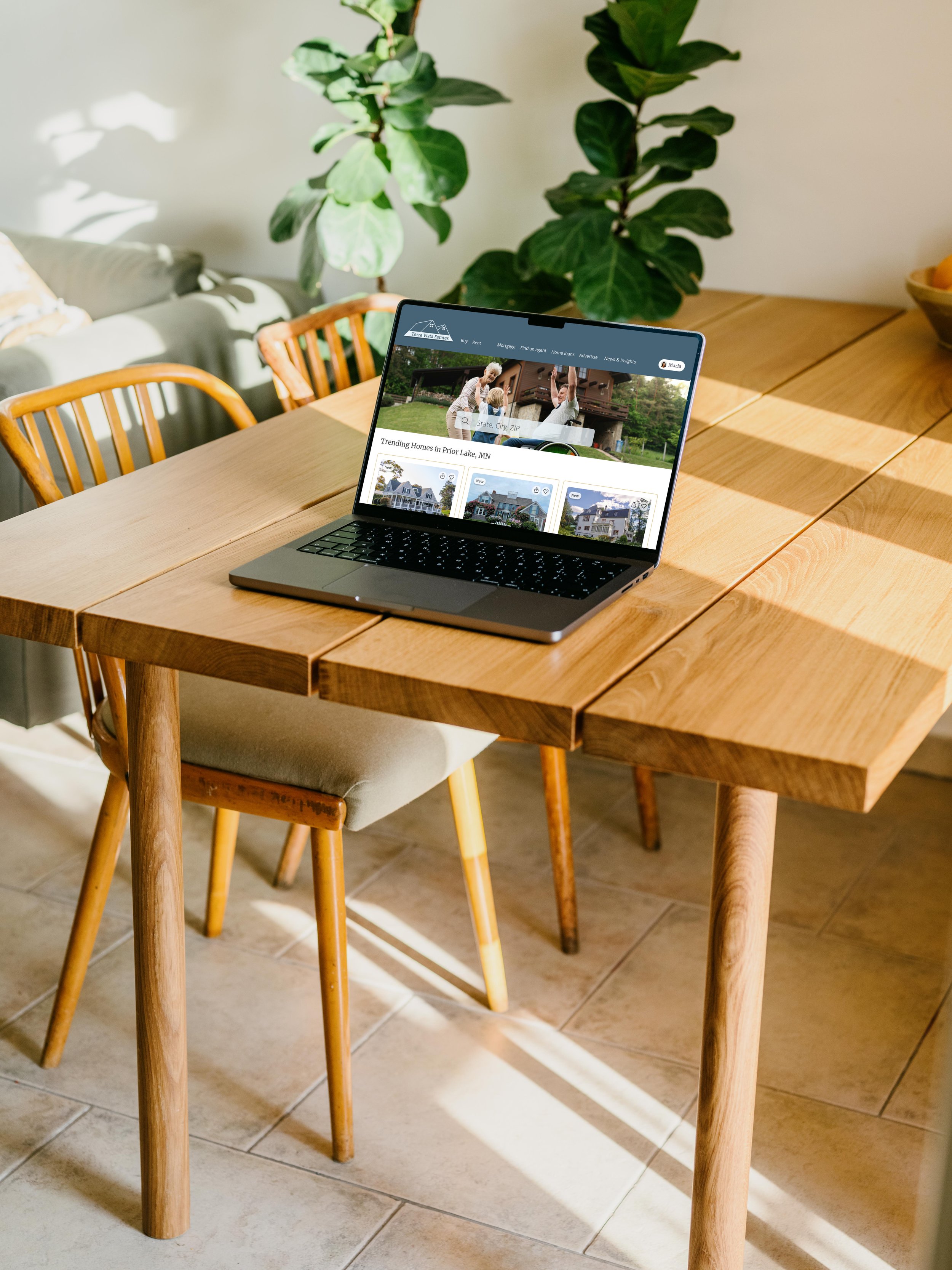
intuitive easy-to-use responsive web app designed to simplify the real estate investment process for fast decision-making.
My Role:
UX/UI Designer
HCD Methods: Low to high-fidelity wireframes, interactive prototypes, user personas, user flow analysis, mood boards, visual style guide.
Features: Searching, filtering, saving favorites, property insights, scheduling viewings and comparisons.
Tools: Figma, Canva, Unsplash
Project Overview
Objective: to develop an intuitive, easy-to-use responsive web app designed to simplify the real estate investment process for fast decision-making.
Goal: to enhance the property investment journey of users with personalized search criteria, comprehensive property details, user-friendly tools for comparison, save properties, and scheduling viewings.

Executive Summary
Enhanced user decision-making with features for searching, filtering, saving favorites, property insights, scheduling viewings and comparisons, reducing user effort and decision time.
Project Highlights:
Created engaging low to high-fidelity wireframes and interactive prototypes using user personas, user flow analysis and mood boards.
Developed a visual style guide featuring a logo, color palette, typography, custom icons and other UI elements; optimized for desktop, mobile and tablet grids.

Watch Video
Empathize
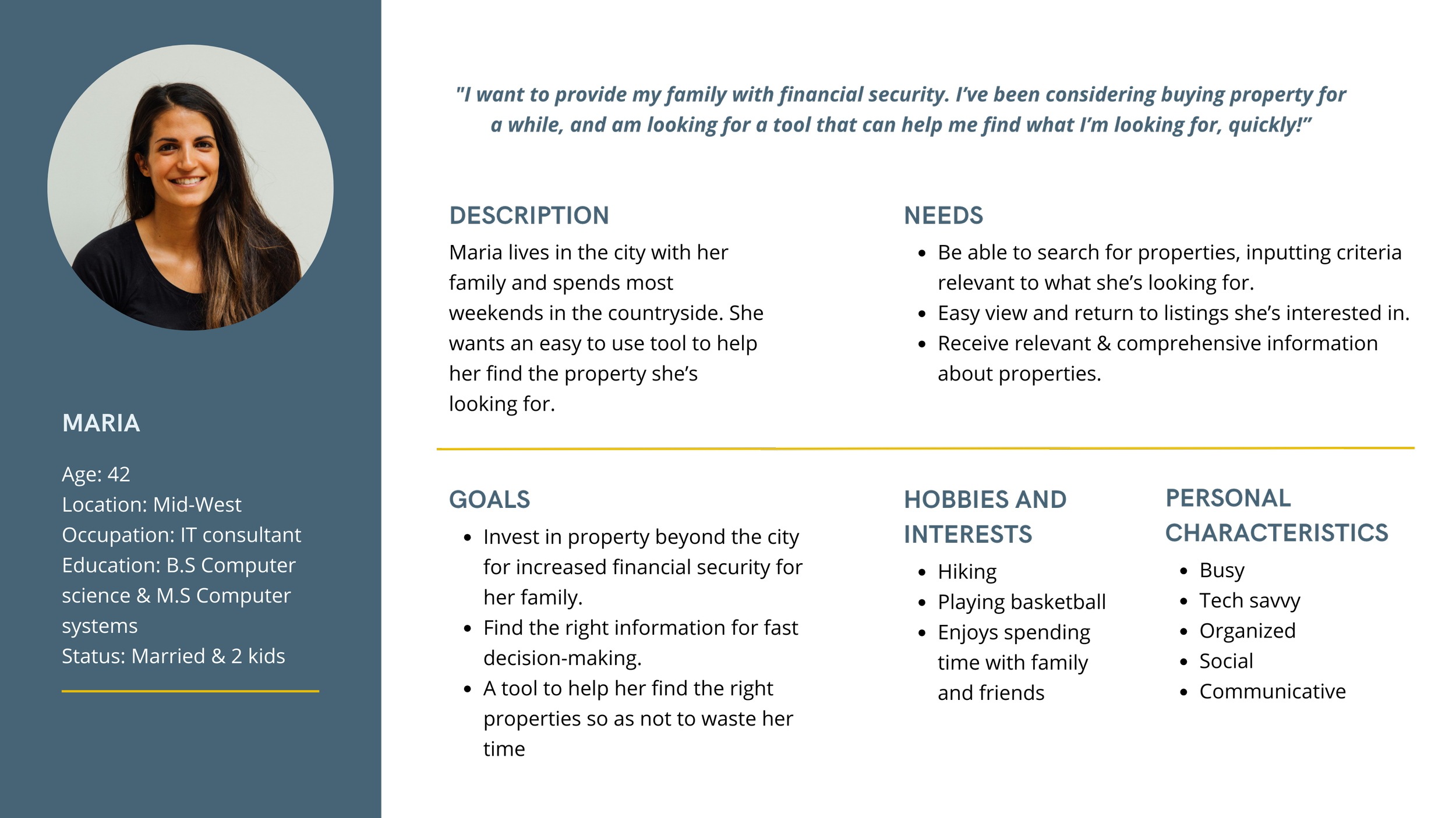
Created a Proto-Persona based on the information provided in the design brief in order to better understand users’ needs, motivations and pain points.
Individuals like Maria could benefit from recommendations matching her investment criteria, concise and relevant property information for quick decision-making and efficient tools to minimize time spent on searches, facilitating a more effective and satisfying investment experience.
Ideate
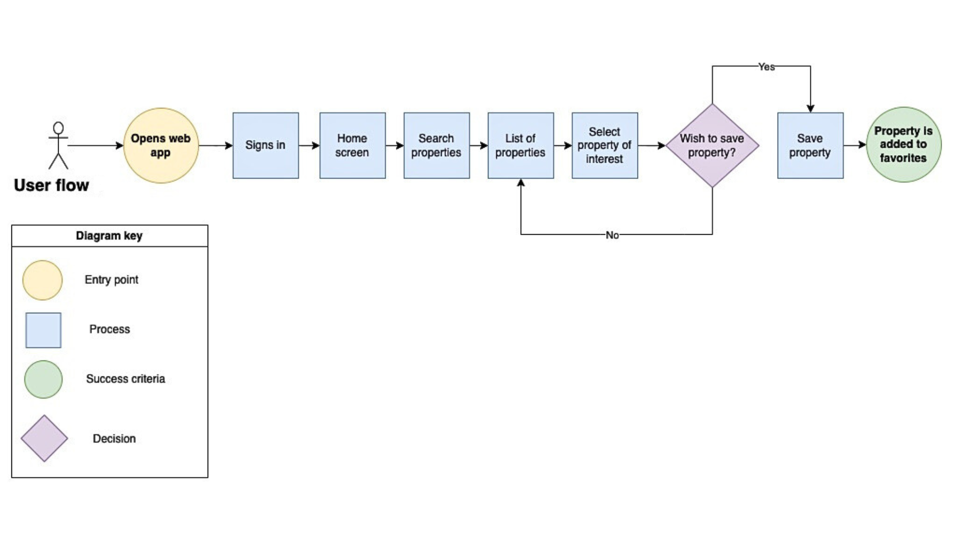
Created user flows based on Maria’s needs to visually map out the step-by-step experience that she and similar users would take when interacting with Terra Vista Estates, and ensuring an intuitive and efficient navigation.
User flow 1: Search and filter properties

User flow 2: Saving properties of interest
Low-Fidelity Wireframes
Started by creating low-fidelity paper sketches that outlined the main functionalities based on the previous user flows.
User Flow 1: Search and filter properties
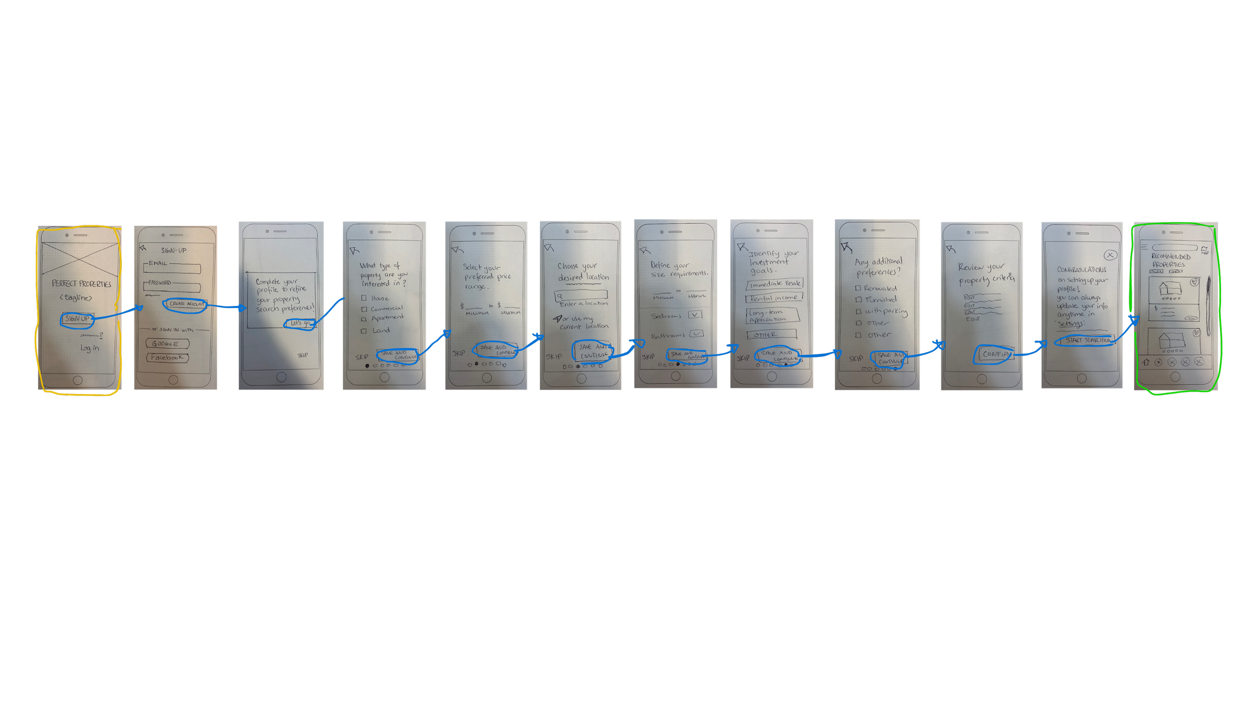
User Flow 2: Saving properties of interest

Mid-Fidelity Wireframes
Continued my designs to mid-fidelity wireframes, incorporating basic UI elements and placeholder text to solidify the layout and show a clearer view of the design’s visual and textual content.
User Flow 1: Search and filter properties

User Flow 2: Saving properties of interest

Design
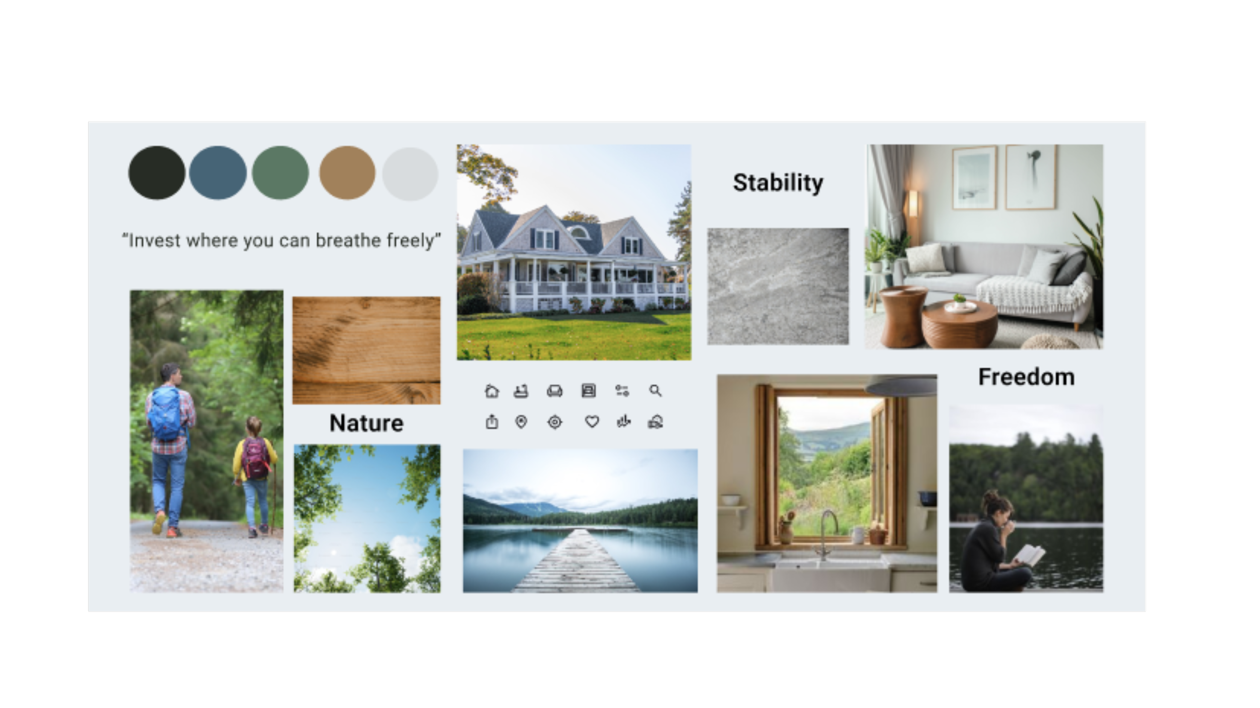
Mood Board
The mood board I created aligned best with Maria’s goals because it has rich earthy tones, evoking a deep sense of stability and grounding, which are an essential foundation for both real estate and personal well-being. In addition, these colors symbolize freedom and growth, giving the feeling of expansive opportunities.
Visual Style Guide
Brand name: Terra Vista Estates
Design: Two houses together in a mountain-like shape resembling a view
Style: Simple, modern & elegant touch
Font: Merriweather
Color: #466476 ; #E7F0F5
Logo on light background


Logo on dark background

Brand icons
Color Palette
Primary color blue are used for branding, important text & icons, and buttons. The white is used for backgrounds.
Secondary blue hues are used in drop down sectors, links, and filter chips. The golden color is used for color accents or outlined dividers and the dark gray is used for text.

Primary colors

Secondary colors

Typography

Grid and Breakpoints
Mobile Tablet Desktop

Iconography

Regular; 2 w stroke; outline format
Size: 24px X 24px, 40px X 40px
Colors: #466476, #3D3D3D

UI Elements
Appropriate & Inappropriate Images
High -resolution images featuring clean, well-lit, or serene natural landscapes that resembles tranquility and prosperity.


Avoid cluttered or poorly lit spaces, dark images, far away houses, chaotic urban settings, half-cut spaces, religious oriented, staged poses from people, lack of diversity or any image that suggests disrepair, neglect, environmental harm, which contradicts to the app’s goal of clean, natural living.


Tone of voice
Professional yet welcoming, aiming for a sense of trust and expertise in the field of real estate investment.
Choice of colors, typography and imagery should evoke a sophisticated and serene atmosphere.
The content and language used throughout the responsive web app should be clear, concise and friendly.
The overall tone should align with the brand’s vision of providing a seamless and stress-free property investment experience.
Final Mockups


Low-Fidelity Responsive Breakpoints
Sketched low-fidelity wireframes with responsive breakpoints for mobile, tablet and desktop to ensure a seamless user experience across all devices, aligning with Maria’s on-the-go lifestyle.

Search results - List view
Mobile Tablet Desktop
Mid-Fidelity Responsive Breakpoints
Designed Mid-Fidelity wireframes with responsive breakpoints for mobile, tablet and desktop to ensure a seamless user experience across all devices, aligning with Maria’s on-the-go lifestyle.
Search results - List view

Mobile Tablet Desktop
High-Fidelity Responsive Breakpoints


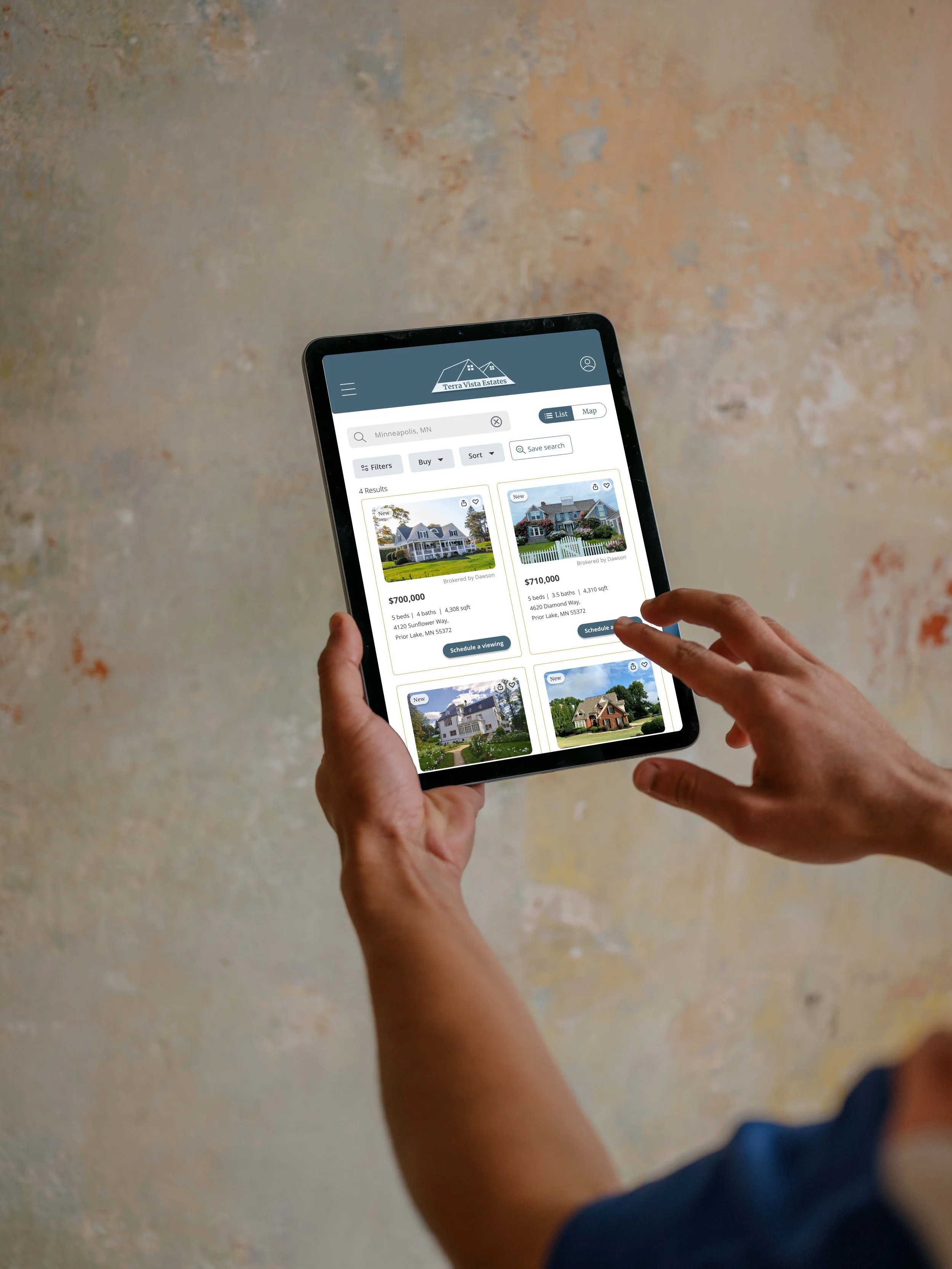


Interactive Prototype